
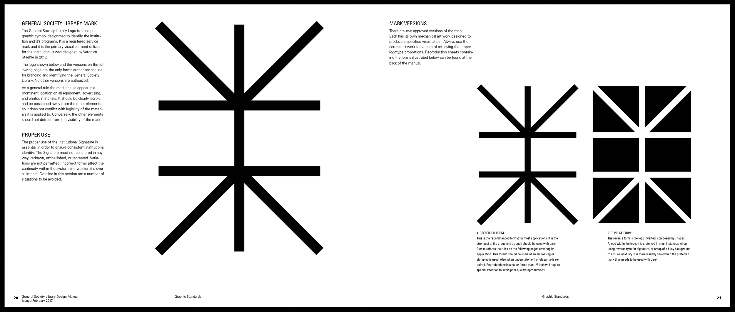
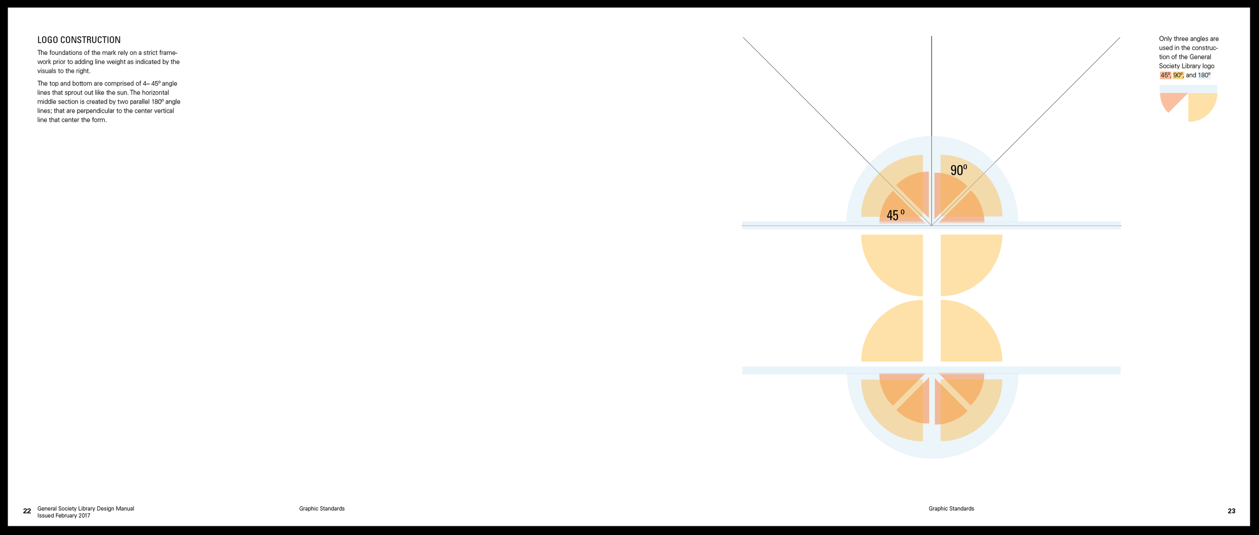
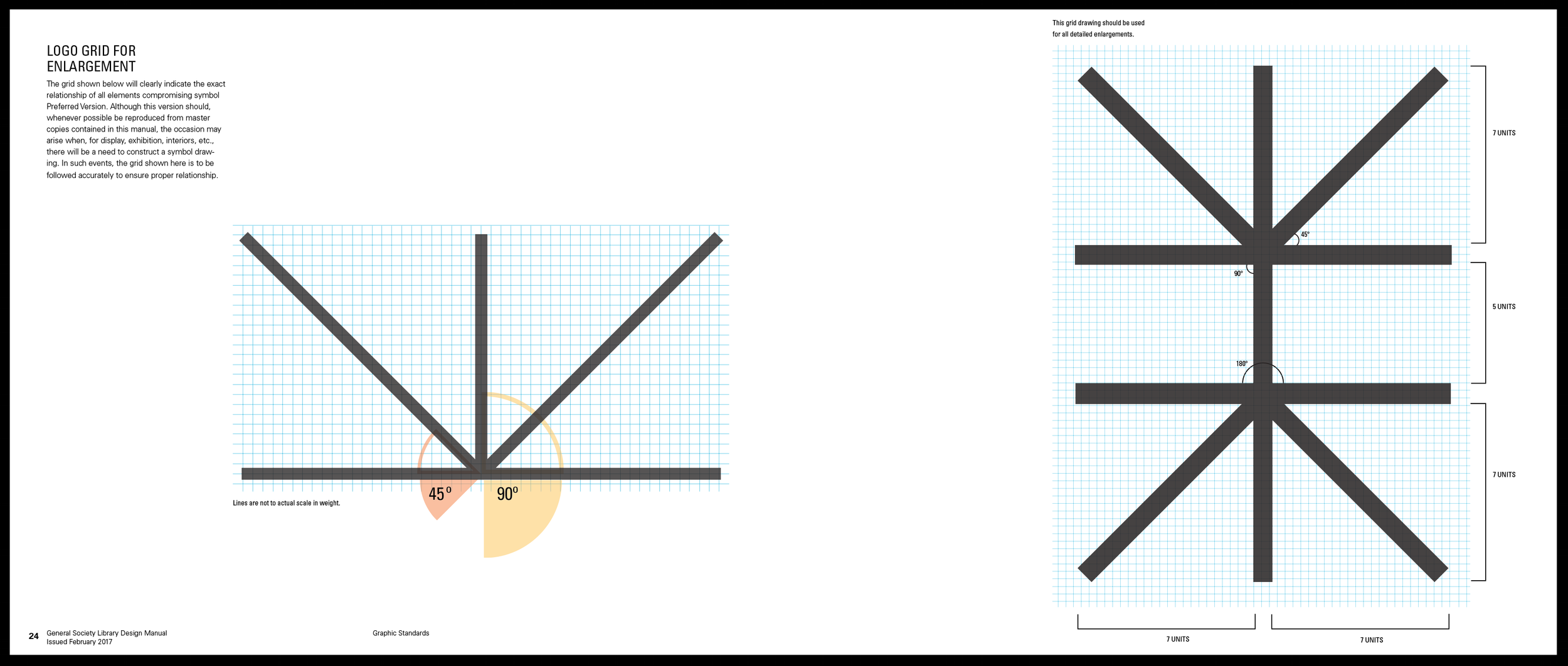
LOGO OBJECTIVE: Utilizing the gorgeous skylight inside the historical library—the new logo is a homage to the structural integrity that is instilled in all those who call the library home, and providing light to all who visit.


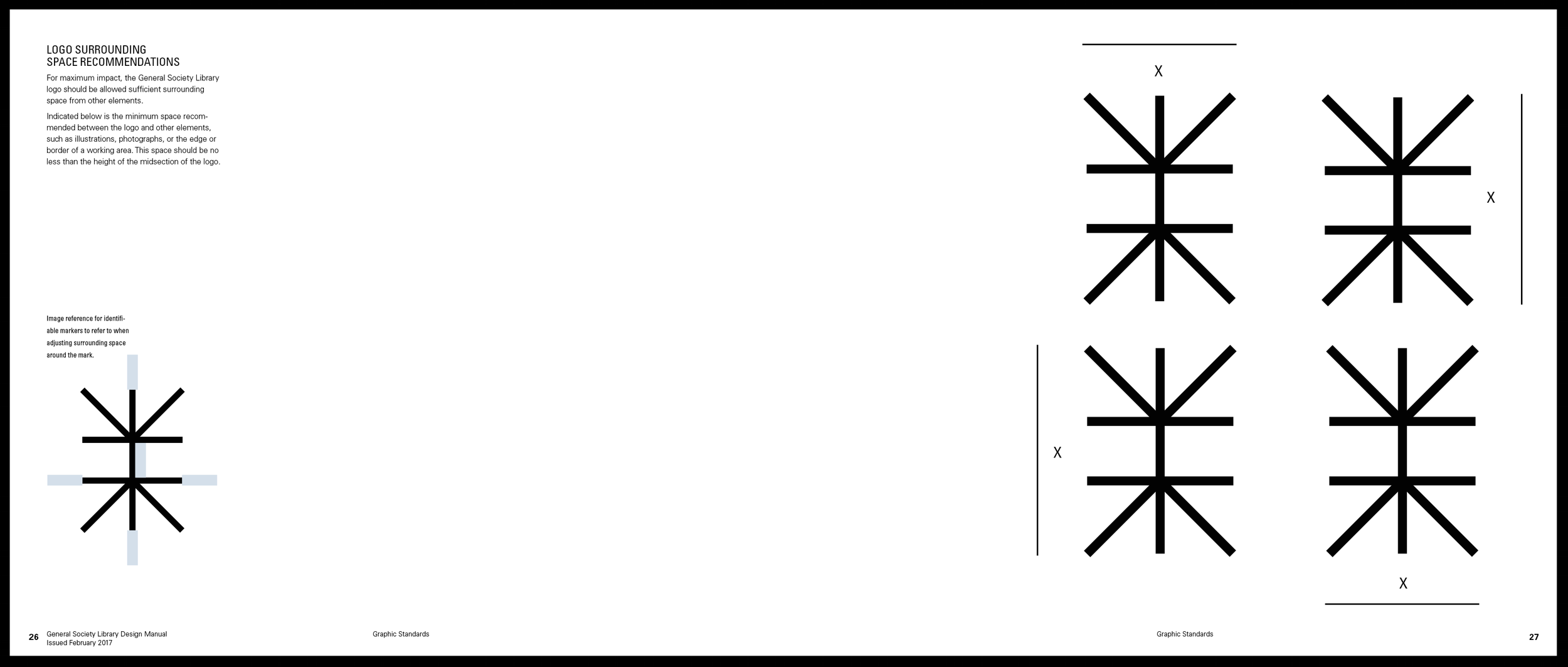
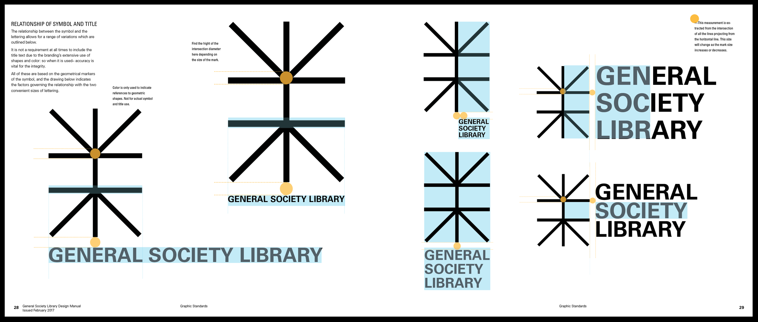
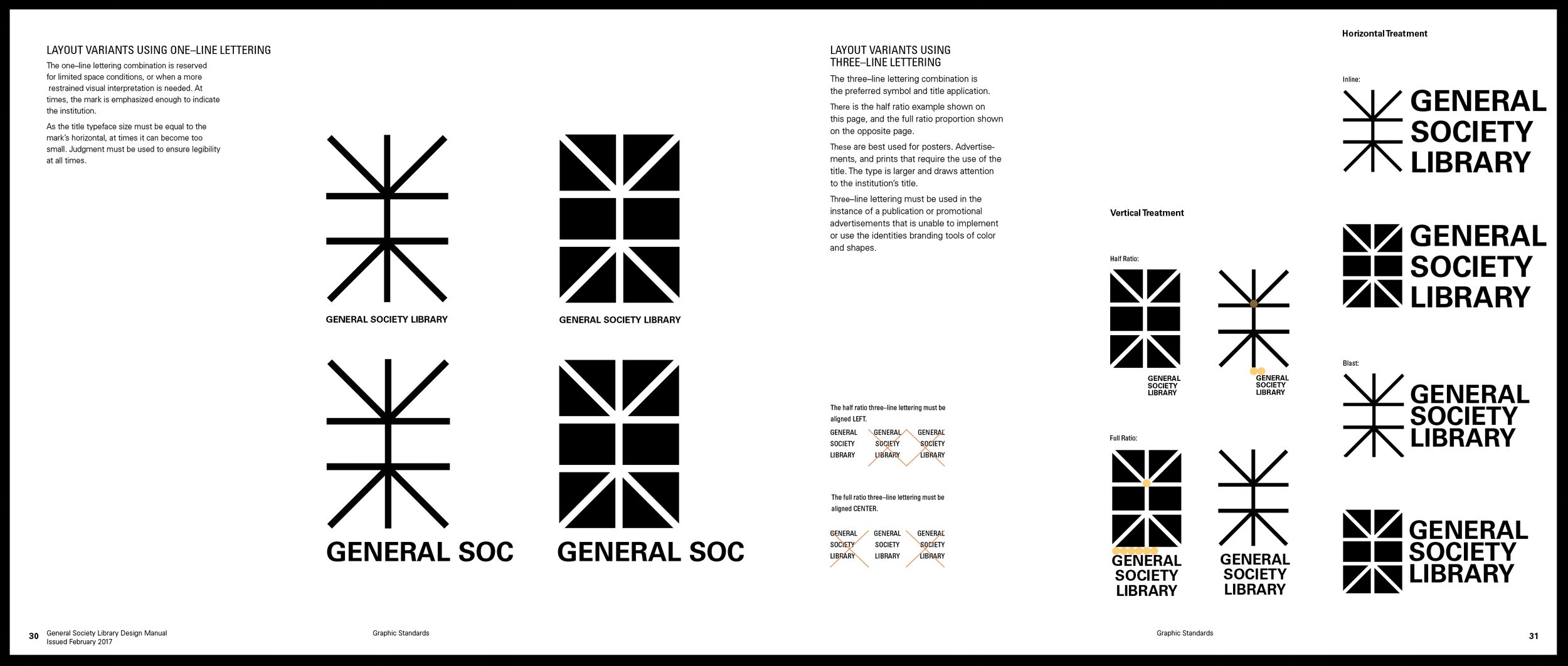
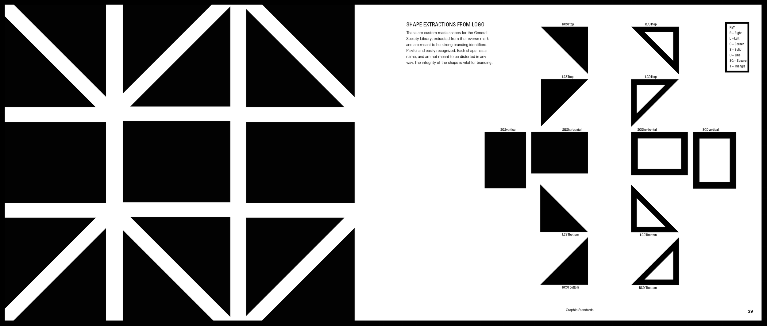
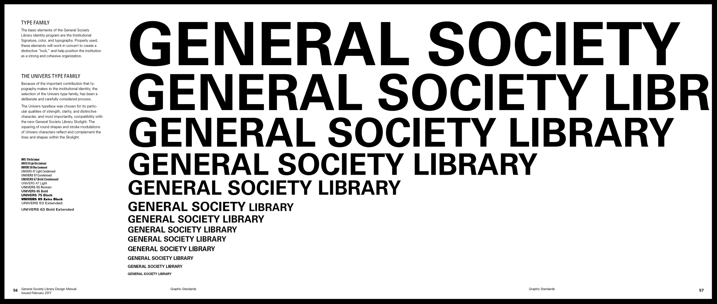
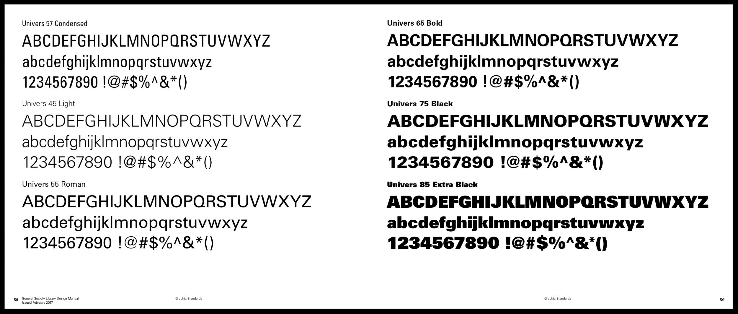
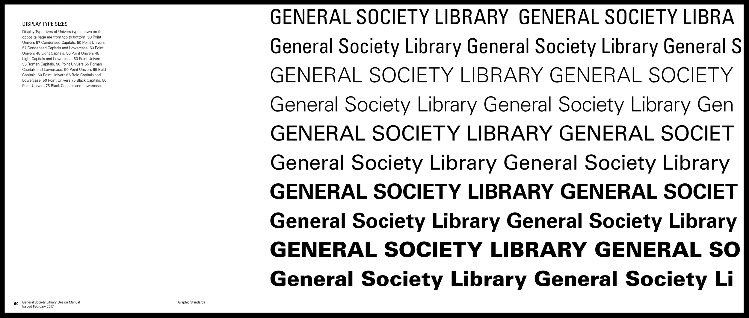
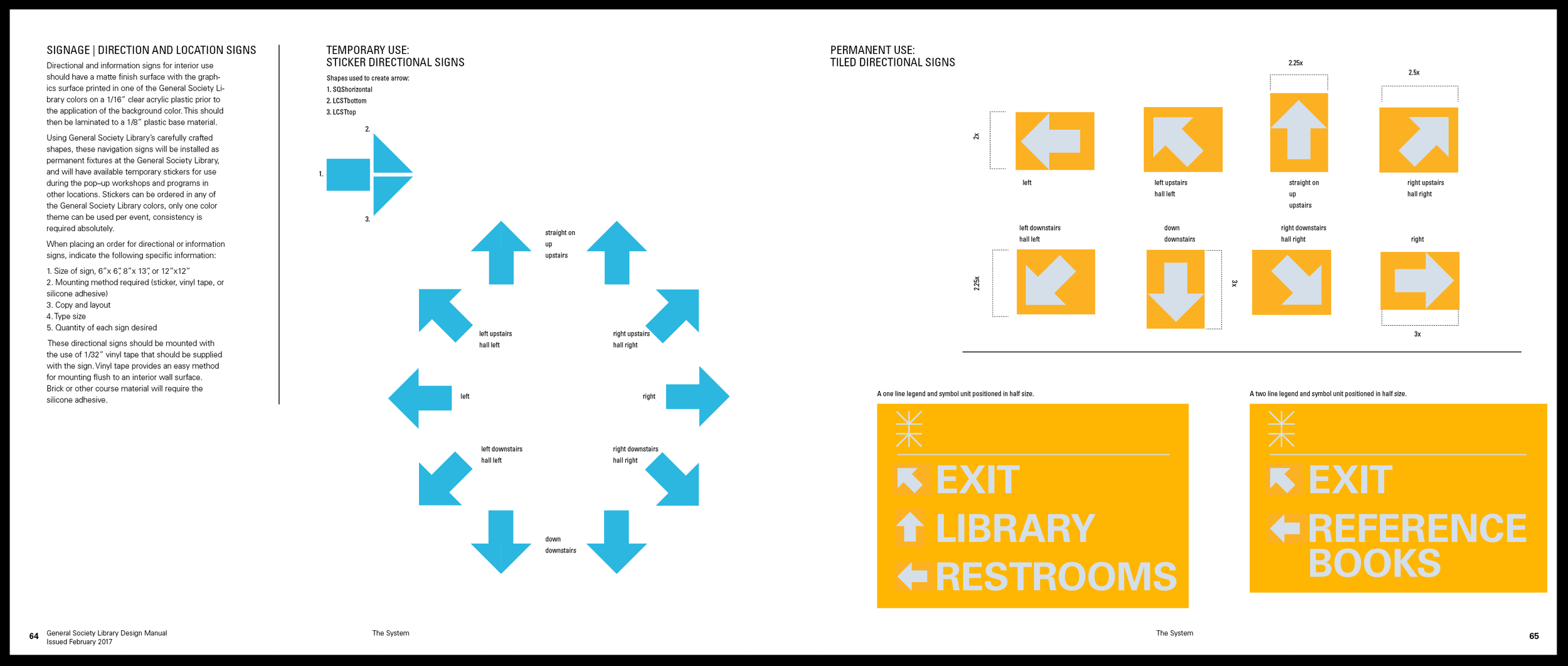
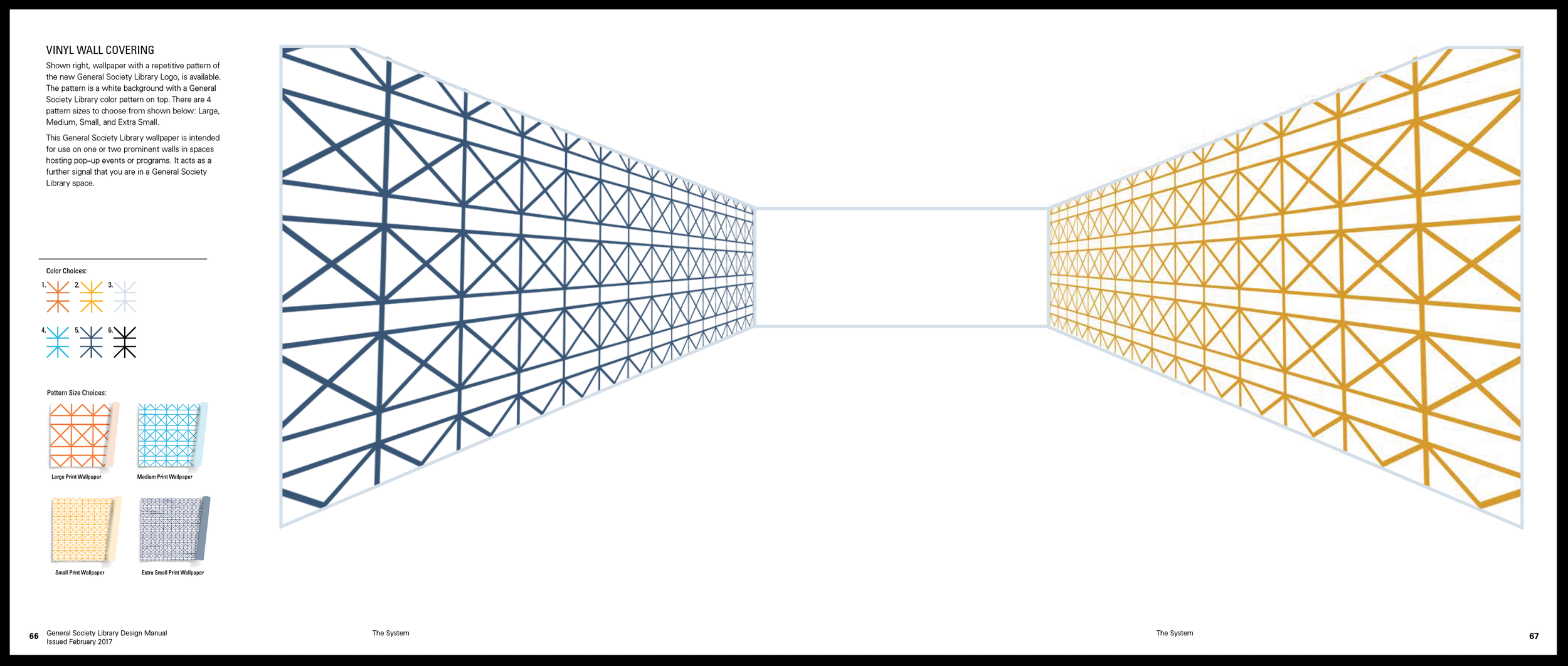
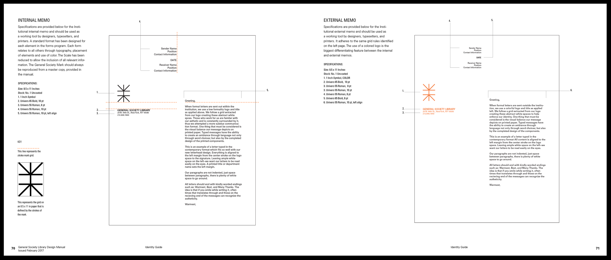
MANUAL DESIGN OBJECTIVE: Extreme detail and care was put into all the aspects of branding creation and systemization needing to be maintained. Including construction of the logo, appropriate uses of the logo, shapes extracted from the logo, color, typography, wallpaper, way finding, stationary and promotional items. Everything is depicted specifically with details to ensure that the branding identity of the institution will remain strong for another 200 years into the future. Below is a streaming gallery of most of the 96 page manual.

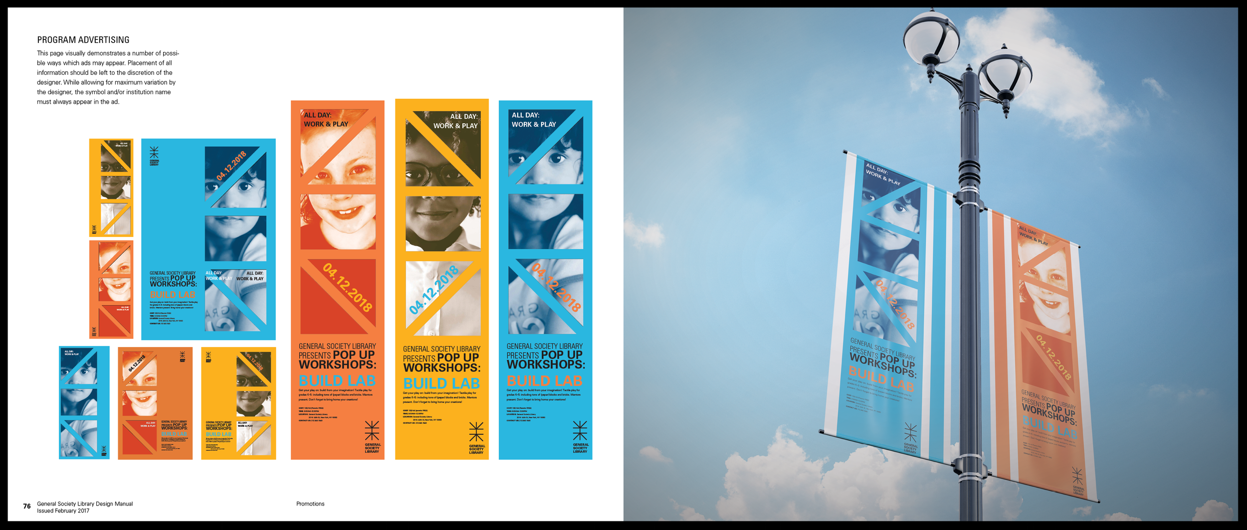

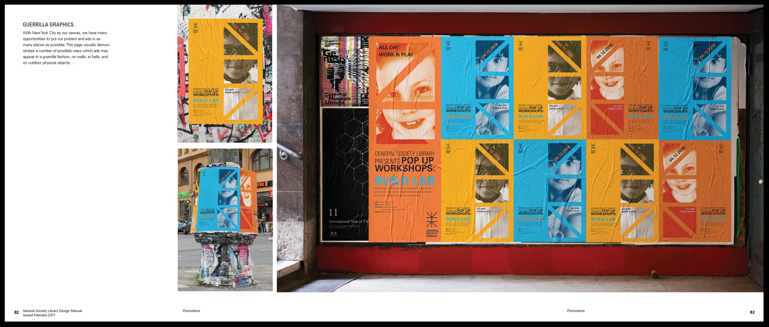
ADVERTISING DESIGN OBJECTIVE: Create a sense of connection and community through the branding shapes and colors and use of eye contact in all the photography. Below are samples of applications of the promotion for the Build Lab event which hosts young girls to come and learn about technical STEM skills. Original poster images of the banners (40 x 10 ft) and posters (35 x 25 in) images located at the bottom.


